March 10, 2014
Responsive Design is NOT a Panacea
Shortcuts make for long delays.
J.R.R. Tolkien
There are now more mobile devices on Earth than people and more than 2 billion new mobile devices will be shipped globally in 2014. Clearly, mobile should be a top priority if you’re building web applications. The question is, how should you tackle this opportunity?
Responsive Web Design?
Responsive Web Design is a popular technique for delivering mobile-friendly websites.
With responsive design, the same HTML is served to every device and only its presentation is adjusted (mostly through CSS) based on the screen size of the device being used. The responsive methodology has become incredibly popular thanks to how easy it is to implement. For example, this very site is responsive thanks to the magic of Bootstrap 3. If your site is a simple blog or set of static HTML pages there’s little reason not to implement a responsive design. However, anything beyond that should be given more thought when it comes to the mobile experience.
Responsive design is not a mobile panacea. It’s not the philosophers’ stone. It’s not a silver bullet. If you’re building a dynamic application with any level of complexity, you cannot simply take the responsive shortcut. There are many reasons why - let’s explore a few of them in detail.
Performance Issues
Responsive designs can come with an incredible amount of overhead. For a mobile user, the entire desktop experience will be requested and rendered on the user’s device and then additional client-side performance hits will come as the views are rerendered into a more mobile-friendly format. According to Akamai (their network is responsible for serving nearly a third of all web traffic), 86% of responsive sites’ mobile pages are at least 90% as big as the desktop versions.
A feature-rich web app could load several modules (sections of content) on a given page. Each of these modules may require multiple database queries and server-side processing. As I’ll discuss below, it often doesn’t make sense to show all of these modules at once on a small screen. In this example, a responsive design would lead to a lot of wasted server-side and client-side processing since inapplicable modules would simply be hidden client-side. Additionally, a slow, non-optimized app impacts not only the user experience (detailed below) but it can also impact other factors critical to your success, such as SEO.
Sure, our phones, tablets and other gadgets are becoming more and more powerful and connectivity speeds continue to improve as well. But that doesn’t mean developers should be lazy when it comes to multi-device app architecture. Just like Olympic alpine skiing, application performance is a game of time - every millisecond counts.
User Experience Challenges
Performance is only one part of the user experience. Context is the key since a user often has very different intentions when using a mobile device vs desktop. Your app’s mobile experience should not simply be a slightly-altered copy of your desktop app. With responsive, that’s what you end up with. Sure, responsive design will allow you to hide or modify certain modules or show some unique mobile-optimized content. This is almost never enough though. On mobile, a completely different navigation, work flow and UI experience are often required.
Another basic failure of responsive design is that it forces a predetermined UI/UX on users - preventing them from choosing which experience (mobile or desktop) they prefer. A non-response design can give users the option to switch to the full desktop experience if desired.
At the end of the day, responsive design leaves you with only a surface-deep, non-contextually aware mobile experience. Is that acceptable for your app?
A Better Approach: Adaptive Web Design
Adaptive Web Design (also known as Contextual/Task-Oriented Design) is one approach that allows you to deliver both a performance and UX optimized mobile experience. This design methodology leverages the appropriately named adapter design pattern where an adapter applies an interface (a set of common requirements) across multiple unique “drivers.” With Adaptive Web Design, the adapter initializes a specific driver based on the device type that’s in use. These device-specific drivers then handle certain logic and perform relevant actions appropriate for the detected device. Here’s a real-world example of how this can work:
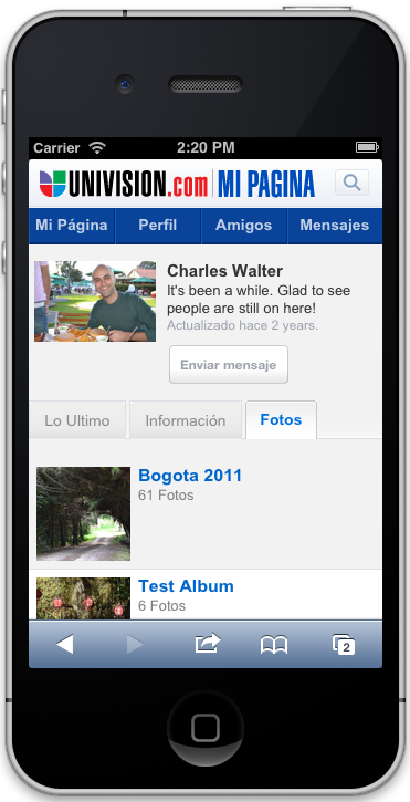
Three years ago, I used adaptive web design to build a mobile CMS. The CMS had two page systems, desktop and mobile, each of which had its own separate layout, navigation, and assets. Additionally, all of the platform’s core features (blogging, photo and video galleries, message boards, activity feed, etc.), were modularized and had separate HTML5 views, CSS and JavaScript for each page system. At a high level, the CMS would receive incoming page requests and first check the logged in user’s pageSystem preference. If no preference existed, the system would default to a pageSystem cookie or the detected user agent. The appropriate driver would be loaded based on the pageSystem setting and then render a beautiful, optimized experience designed specifically for the device type.
Adaptive web design certainly requires more work to setup a page-system-like architecture with dedicated views for each device type. This approach was particularly powerful for a CMS since it allowed completely custom page layouts to be created for any type of device. This amount of flexibility may or may not be necessary for your application. The message here is that you can dramatically improve your mobile offering by implementing Adaptive Web Design. Fortunately, most modern software frameworks can be easily extended to add this core functionality with modest effort.
What Do You Think?
Before building or upgrading your mobile experience, consider whether responsive web design is the right choice for you. I hope you’ll choose an approach that pushes the boundaries of web applications and delivers the best possible experience for your users. I’d love to answer any questions you may have or hear about your preferred approach. You can find me @smwxforever.